DEV3 Technologies home

DEV3 MARKETPLACE

UI Components

Big animated UI components in Tailwind CSS v4 with GSAP motion and optional 3D: buttons, switches, dialogs, navbars and more. Copy the markup. From $5.
2
items
4
frameworks
2
updated this week

Motion Components is a line of large, single-page UI components, each with one physical signature animation: a key you turn to launch a button, a wall switch that lights the room, a stamp that slams down on success. Every component page shows two or three variants in light and dark themes and a copy-the-markup section. Styling is Tailwind CSS v4 with shadcn-style design tokens in CSS variables, so re-theming means changing about six variables, and the compiled tailwind.css is included, so there is no CDN and no build step. Motion runs on GSAP, with three.js only where a component is marked 3D. Components work with the keyboard, follow ARIA patterns and respect reduced-motion settings.

Search
Frameworks
Sub-category
Tags

2 items

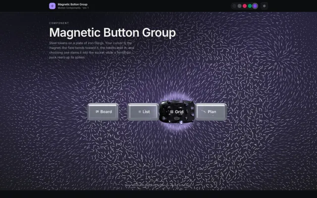
Magnetic Button Group: Iron Filings, Steel Tokens and a Ferrofluid Puck (three.js) — Animated UI Component (3D)

Magnetic Button Group: Iron Filings, Steel Tokens and a Ferrofluid Puck (three.js) — Animated UI Component (3D)

A segmented control on a live field of thousands of iron filings that bend toward your cursor. Steel tokens lean in, selecting one slams it into the socket with sparks and a field pulse while a spiky ferrofluid puck follows. three.js shaders, Tailwind v4 markup, ARIA, light/dark presets.

HTML5Tailwind CSSJavaScriptThree.js
(0)

0 sales 1 viewsUpdated 1h ago

from

$5
Preview

Frequently asked questions

A zip with the component page in plain HTML, the compiled Tailwind CSS, the design tokens, GSAP (and three.js for 3D components), a README and the licence notes.